Introduction
First Aid Poster Design Tips For Animals Health And Fitness helps you create clear, effective posters that provide vital information for quick response during emergencies involving animals. A well-designed first aid poster grabs attention and communicates essential steps concisely to assist in an animal’s care.
This article guides you through practical tips on selecting design elements, including layout, colors, and visuals tailored for animal health. You will learn why these choices matter and how to organize information so anyone can act fast when an animal needs first aid.
Purpose Of Animal First Aid Posters
Animal first aid posters serve a practical role in places where animals’ health and fitness matter a lot. You often see them in veterinary clinics, training centers, or shelters. Their clear and direct signage helps cut down response times during emergencies. It’s easier for someone to take quick action when instructions are visible and straightforward.
Think about moments when every second counts — whether it’s an injury or sudden illness. A poster can guide you through steps without having to remember complex procedures. So, it’s not just about having information but delivering it clearly so people can react calmly and effectively, enhancing the chances of better care and outcomes.
Who Benefits From These Posters
These posters are practical tools useful for various people involved with animals:
- Pet owners, who might feel overwhelmed during their pet’s distress, turn to the posters for quick guidance.
- Veterinarians use them as handy reminders or training aids in busy clinics.
- Animal trainers reference them to handle health issues during sessions.
- Shelter workers rely on posters to act fast when animals need urgent care but vets are temporarily unavailable.
Each group depends on clear, concise information for swift intervention tailored to the situation. The general public, too, benefits when responsible people have access to the right knowledge at the right time.
Typical Situations Requiring Posters
Posters are most helpful in common yet stressful animal emergencies. Examples include:
- Injuries like cuts, bites, or fractures that require immediate first aid.
- Choking episodes — knowing how to respond before professional help arrives is crucial.
- Heatstroke cases, especially in hot climates, where timely cooling measures can save lives.
- Poisoning or exposure to harmful substances, which demands quick identification and action.
Places where these signs appear are usually areas such as training arenas, kennels, farms, or vet waiting rooms—spots where quick access to first aid knowledge can make a significant difference.
Choosing Clear And Simple Language

When designing a first aid poster, picking clear and simple words is crucial. You want anyone, no matter their background, to grasp the message instantly. Think about everyday language—words people use daily rather than specialized terms. Instead of saying “administer analgesics,” say “give pain relief.” It’s about keeping things straightforward.

Jargon or technical terms often slow down quick understanding. Imagine someone in an emergency trying to decode medical phrases—they might hesitate, and time slips away. Use familiar words—even if they seem a bit plain—to avoid confusion. It’s tempting to sound precise but remember, clarity beats complexity here.
Consider testing your wording with people outside medical or animal care fields to see if it clicks. If they pause or question the meaning, that’s a cue to simplify further. You want the language so accessible that anyone glancing at the poster can immediately know what to do.
Using Short Instructions
Short, direct instructions are your best friend in first aid posters. They cut through noise and tell exactly what to do—no room for misinterpretation. For instance, saying “Stop bleeding” is clearer than “Apply hemostatic techniques.”
Commands like “Call for help,” “Check breathing,” or “Cover wound” work because they’re easy to follow. They break down into quick steps anyone can remember, even under stress. A long sentence might be overlooked or forgotten.
Brief commands also speed up action. When you see “Apply pressure,” you don’t second-guess; you just do it. In emergencies, that split second really matters. Short instructions guide your reader’s eyes and hands in sync, making the response quicker and more confident.
Checking Readability For All Audiences

Readability isn’t just about words—it’s also how text looks. Font size matters a lot; too small and people strain to read. Aim for at least 18 to 24 points in main instructions, bigger for headings. Simple fonts like Arial or Verdana often work better—no fancy cursive that could confuse.
Test your poster with different age groups. Will a teenager find it easy? How about seniors? If they squint or ask for clarification, you might need bigger font or simpler phrases. Tools like readability scores can help too; they measure if your text fits the average reading level.
Remember, you want the text clear enough that both youth and adults feel comfortable without guessing. Combine readable fonts, appropriate sizes, and straightforward language to reach everyone who may need to act fast. This mix makes your poster genuinely effective in real situations.
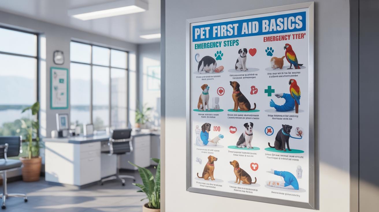
Visuals That Enhance Understanding

When creating a first aid poster for animal health and fitness, choosing the right visuals is a bit tricky but super important. Images, icons, and diagrams should be crystal clear in showing the steps—like where exactly to press or wrap a sprain. Visuals don’t just decorate the poster—they work as quick guides that save time in emergencies. Sometimes, a well-placed diagram can clarify instructions that words alone might clutter. You might find yourself glancing at a symbol or a step-by-step picture and suddenly it all makes more sense, especially if your mind’s racing.
When To Use Illustrations Vs Photos
Simple illustrations often do better than photos for certain steps. For example, showing exactly how to position your hands during CPR or apply pressure to a wound? Illustrations can isolate just the important details, cutting out the noise. Photos, with all their complexity and background, can confuse or slow down understanding. But photos might work well when showing realistic injury examples or how to spot symptoms on animals. It’s a bit like asking—do you want precision or context? For clear instructions, illustrations usually win.
Color Choices That Capture Attention
Colors on a first aid poster should do two things: make the message loud and clear, and keep it readable. Red is the classic alert color—you’ll likely want that to highlight emergency actions or warnings. But too much red can feel aggressive or tiring to the eyes. Balancing it with neutral backgrounds like white or soft gray helps the red pop without overwhelming. Contrast is key. Think black text on white or yellow on dark blue—these combinations make reading easier even from a distance. Bright colors grab attention, but be cautious not to turn the poster into a confusing rainbow.
Organizing Content For Easy Skimming

When designing a first aid poster for animal health and fitness, your biggest challenge is helping readers find key information quickly. You want the content to flow naturally but also be scannable. This means breaking up dense text with clear headings and enough spacing.
Try using distinct headings to section off topics—this guides the eye and helps users know where to look immediately. Bullet points are almost essential because they turn long paragraphs into bite-sized, digestible steps. It’s curious how much easier instructions become when broken down into short lines rather than crowded sentences.
Spacing around text and between sections also plays a role. It creates a visual pause, giving readers a moment to absorb before moving on. Don’t cram everything together hoping they’ll read it all—chances are, they won’t.
Using Bullet Lists For Steps
Bullet point lists breakdown complex procedures into manageable chunks. Imagine detailing how to handle a choking dog versus dumping all instructions in a solid paragraph—bullets help avoid confusion and frustration.
Each step should feel independent yet part of a sequence. Simple sentences, no fluff. The convenience is you can scan, remember, and act without rereading just to understand the basics. I have seen posters without bullets where people seemed lost or overwhelmed—lists definitely simplify things.
Highlighting Key Actions
Critical advice needs to stand out. You can do this by using bold text or color highlights on key verbs or warnings. For example: Apply pressure, Call your vet, or Stay calm. This draws immediate attention and sparks the right response.
Colors can guide emotions—red for danger, green for safe steps. But don’t overuse; too many highlights cause distraction. It’s about balance. What’s interesting is how subtle contrasts often attract more than loud colors. Your goal is to make vital points unmistakable without overwhelming the reader.
Important Elements To Include In Posters

When designing a first aid poster for animals, you want to make certain that it includes several key components that could actually make a difference during an emergency. Think about what a pet owner or caretaker might need at the moment an incident happens — clarity and quick access to critical information is essential.
Here are some elements to consider including:
- Emergency Contact Information: This should never be overlooked. Having the local vet’s phone number and poison control center readily visible is crucial. People often hesitate or fumble when faced with a crisis; clear contact details provide reassurance and speed up getting help.
- Quick Action Steps: Outline straightforward but effective first aid actions, like how to stop bleeding or clear an animal’s airway. These steps should be brief and easy to follow—something you could glance at and immediately act on.
- Safety Tips: Small reminders such as how to safely restrain an animal or avoid getting bitten can be surprisingly helpful. Emergencies can be chaotic, and emphasizing safety helps both the animal and the caregiver.
Emergency contacts, especially vet and poison control numbers, have a special place on the poster. During a crisis, you might not have the luxury of time to look up numbers or remember the right one to call. Poisonings or injuries require specialized advice that the poison control center or vet can provide promptly. Trust me, when a pet has eaten something potentially toxic, a quick call could save its life.
Regarding basic first aid steps, it’s useful to include key procedures that anyone can attempt without specialized training. For example: applying pressure to stop bleeding, performing a gentle airway check, or cooling burns. These don’t encompass all possible emergencies but cover the basics enough to stabilize the animal until professional help arrives.
Sometimes I’ve seen posters too cluttered, overwhelming the viewer with info, which defeats their purpose. Keeping it simple, practical, and focused on lifesaving measures seems best. Your poster should help someone act confidently, even if they feel unsure or panicked.
Comparing Poster Formats And Sizes


When designing first aid posters for animal health, size and format matter—more than you might first assume. Large posters grab attention in busy areas, while smaller ones suit personal use. Think about where the poster will be: home, clinic, or an outdoor setting. That context changes what works best.
Print posters offer tangible, quick reference. You can’t scroll past them like a digital screen. But digital posters are flexible—easy to update, share, and even interactive if designed well. In homes, a small, sturdy print poster might be best for pet carriers or refrigerators. In contrast, clinics and shelters benefit from bigger prints, easy to spot across rooms.
Some formats simply fit the space better. Vertical posters suit narrow walls; horizontal fits wider spaces. Digital displays can cycle through tips, though they rely on technology staying on. Printed posters remain visible without electricity or batteries, which counts in emergencies.
Large Posters For Public Spaces
Big posters at vet clinics or shelters have clear perks. They hold lots of info and catch attention fast—even in a crowd. Imagine a wall-sized poster outlining CPR for dogs or cats, visible from the reception desk. That immediate access can make a difference when time is tight.
They also serve as educational tools, guiding pet owners or volunteers in real time. The size means smaller print or dense info works better, but be careful not to overwhelm viewers. Using large visuals alongside bullet points helps comprehension.
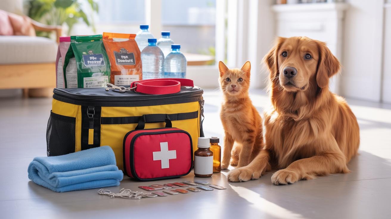
Compact Posters For Home Use

Smaller posters fit snugly in homes, often tucked in with pet supplies. Their durability matters, too—laminated or waterproof finishes make sense around spills or outdoor trips. A mini first aid guide clipped to a pet carrier reassures owners during travel.
The challenge? Conveying enough info legibly on a small surface. Choose key steps and visuals that stick. Compact posters encourage quick glances rather than deep reading, so focus on essentials. Maybe even a foldable design to expand when needed—but that might be more hassle than help for some.
Steps To Create Your Poster Effectively

Planning Your Content
Start by collecting reliable information about first aid for animals. Don’t rush this part. You might want to check veterinary sources, animal health guides, and trusted websites. It’s easy to get overwhelmed—there’s a lot of advice floating around, some more accurate than others. Pick what truly matters for your audience. Are you targeting pet owners or animal care professionals? This changes the level of detail.
Keep your content focused. Avoid cramming too much. Highlight key actions, like how to recognize an emergency, basic treatment steps, and when to seek vet help. Imagine the poster hanging in a busy vet clinic or a pet shelter—clarity and quick comprehension are vital. Bullet points work well here.
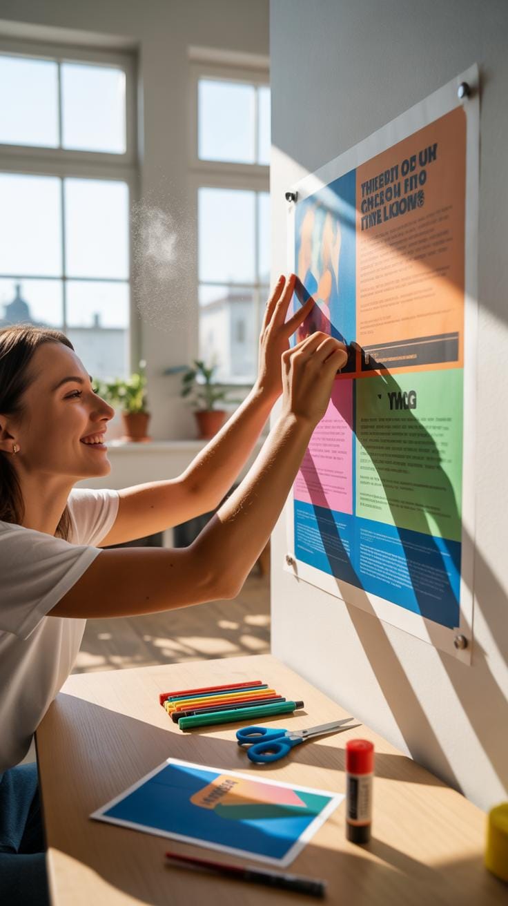
Design And Proofreading
Once your content is clear, choose a design tool you feel comfortable with. Maybe a simple online editor or a more advanced program like Adobe Illustrator—whatever suits you, really. Fonts should be readable from a distance, but you don’t want them boring either. A mix of bold headings and clean body fonts usually works.
After your first draft, step back and look at it with fresh eyes. Ask friends or colleagues to review it. Sometimes you miss typos or confusing wording because you’re too close to the project. Don’t hesitate to tweak the layout or colors based on feedback. Try printing a test copy—colors and sizes can look different on paper. This whole process might feel painstaking, but it’s worth it to have a poster that actually gets noticed and understood.
Common Mistakes And How To Avoid Them

When creating a first aid poster for animals, it’s easy to fall into some traps that hurt clarity and usefulness. One big issue is clutter. A poster overloaded with text or tiny, squeezed-in details can overwhelm anyone trying to find quick help. Instead, focus on the essentials—prioritize a handful of steps that anyone can follow without hesitation. Think about the moments of stress when you might refer to this poster; simplicity matters.
Another typical mistake involves images. Choosing pictures that don’t clearly relate to the action or that show ambiguous situations can confuse more than help. For example, a casual pet photo might not communicate the urgency or specific technique needed for CPR. Opt for clear, direct images—like illustrations or photos showing hands doing the task or simple diagrams indicating pressure points.
Try to avoid mixing styles, too. Too many colors, fonts, or image types scatter attention and break focus. So keep your visuals aligned and your text concise. It’s tempting to include as much info as possible, but guess what? Less is almost always more here. What’s your priority—the animal’s safety or showing off every detail you know?
How To Update And Maintain Posters
Keeping your first aid posters current means more than just occasional glances. It’s worth setting a schedule—say, every six months or after any major updates in animal care guidelines—to check if your posters still reflect the latest practices. Sometimes changes in recommendations sneak in quietly, so making it a routine helps you catch those shifts in time. You might find it useful to mark these dates in your calendar or tie them to other regular safety checks.
Protecting the posters ensures they remain visible and legible. Laminating the paper or using durable plastic covers can fend off tears and spills. Consider where you place them, too. Avoid direct sunlight spots, which cause colors to fade over time, and high-traffic areas where they might get bumped or smudged. A slight trade-off exists between accessibility and preservation—you want them noticed but safe from damage.
Reflect on where you have seen worn-out posters that no one actually read. Can you strike a balance so your posters stay both fresh and in good shape? It takes a bit of thought and effort, but it keeps your vital messages clear when they matter most.
Examples Of Effective First Aid Posters
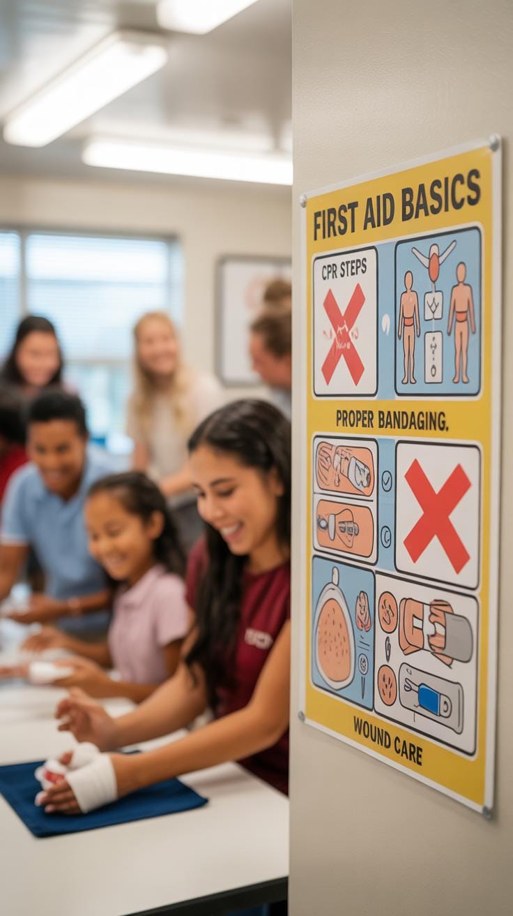
When it comes to first aid posters for animals, effectiveness hinges on clear communication and practical focus. Posters that resonate well usually stick to simple steps and visuals that anyone can quickly grasp. It’s almost like the poster needs to anticipate the moment of panic and provide calm, straightforward guidance.
Take a moment to think about where these posters hang. In a vet clinic, you want detail but without overload. For pet owners at home, direct instructions for emergencies feel more critical than anything else.
What makes a poster work well? Here are some ideas gleaned from observing different settings:
- Prioritize clarity in layout – big headings, bullet points, simple icons.
- Use plain language, avoiding jargon, because you can’t assume deep knowledge.
- Incorporate step-by-step emergency actions tailored to the setting.
- Keep color schemes and contrasts that draw attention without causing confusion.
- Make it memorable with a few key reminders rather than a wall of text.
Effectiveness is partly about visual digestion speed but also about trustworthiness and relevance to the viewer’s immediate concerns. Maybe that’s why some posters use photos of common pets to make it feel more personalized, which might calm a nervous pet owner more than generic images.
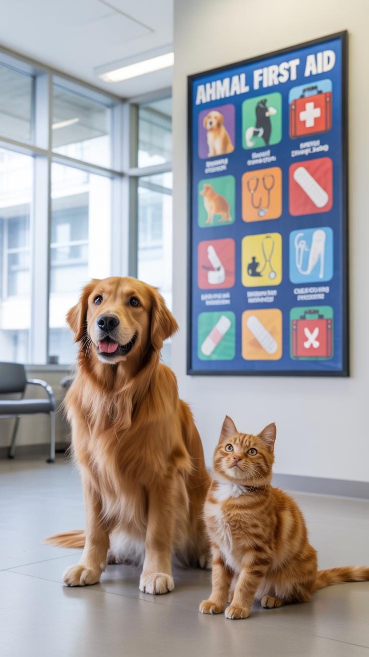
Poster Example From Veterinary Clinic
Picture a poster in a vet clinic, quite close to the reception area, where it can catch the eye but not overwhelm the space. It usually features a clean, grid-like layout. Sections break down types of common emergencies: choking, injuries, heatstroke—you name it. Each section includes an easy-to-follow flowchart.
What stuck with me there was the use of color coding; for instance, red for urgent steps, green for calming measures, and blue to signal when to call the vet immediately. The fonts are simple and large, minimizing strain for stressed pet owners. The content choices lean heavily on actions: what to do in the first few minutes and when professional help is mandatory. Conveniently, the clinic’s emergency contact is prominently displayed, reducing guesswork when panic strikes. It seems practical and thoughtful without feeling cluttered.
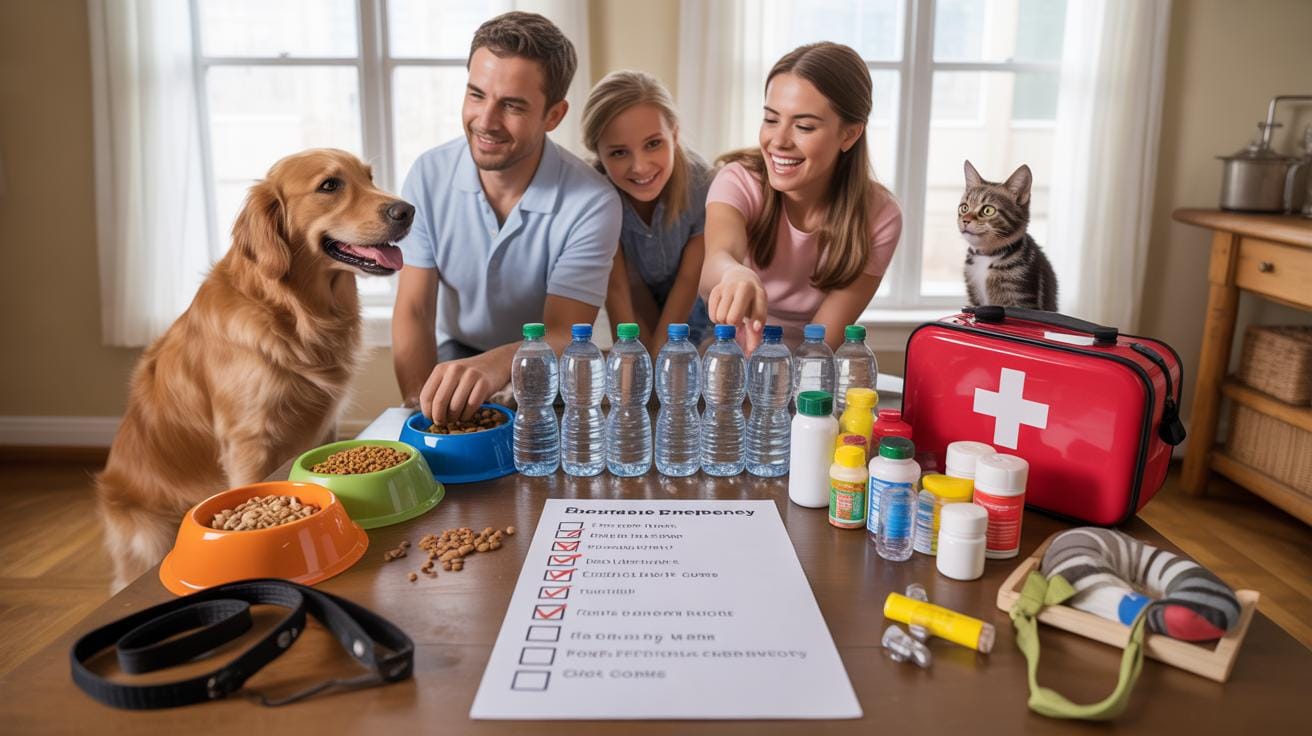
Poster Example For Pet Owners
Now, think about a poster designed primarily for pet owners at home. It’s usually found near where pet supplies are stored. This one focuses on immediate, hands-on emergency actions that a pet owner can do right away, before reaching out to a vet. For example, how to perform basic wound care, recognizing signs of poisoning, or dealing with heat exhaustion.
This poster leans toward using stepwise instructions supported by simple illustrations, like showing where to apply pressure to stop bleeding or how to do a basic airway check. The tone here is a bit softer, maybe because it’s meant to reassure as well as instruct. The language avoids technical terms and instead uses phrases like “Check your pet’s breathing” or “Keep your pet calm.” It’s less about diagnostics and more about immediate care.
What’s interesting is how this poster also includes a small reminder about regular health check-ups and vaccination schedules – a gentle nudge toward prevention rather than just emergency reaction.
Conclusions
Designing a first aid poster for animals requires thoughtful choices in layout, images, and text to ensure clarity and speed in emergencies. Clear steps and recognizable visuals help reduce confusion and guide quick decisions that can save animal lives.
By applying these design tips, you can create posters that effectively support animal health and fitness. Keep the focus on simplicity, direct instructions, and relevant visuals for the best impact when it matters most.