Introduction
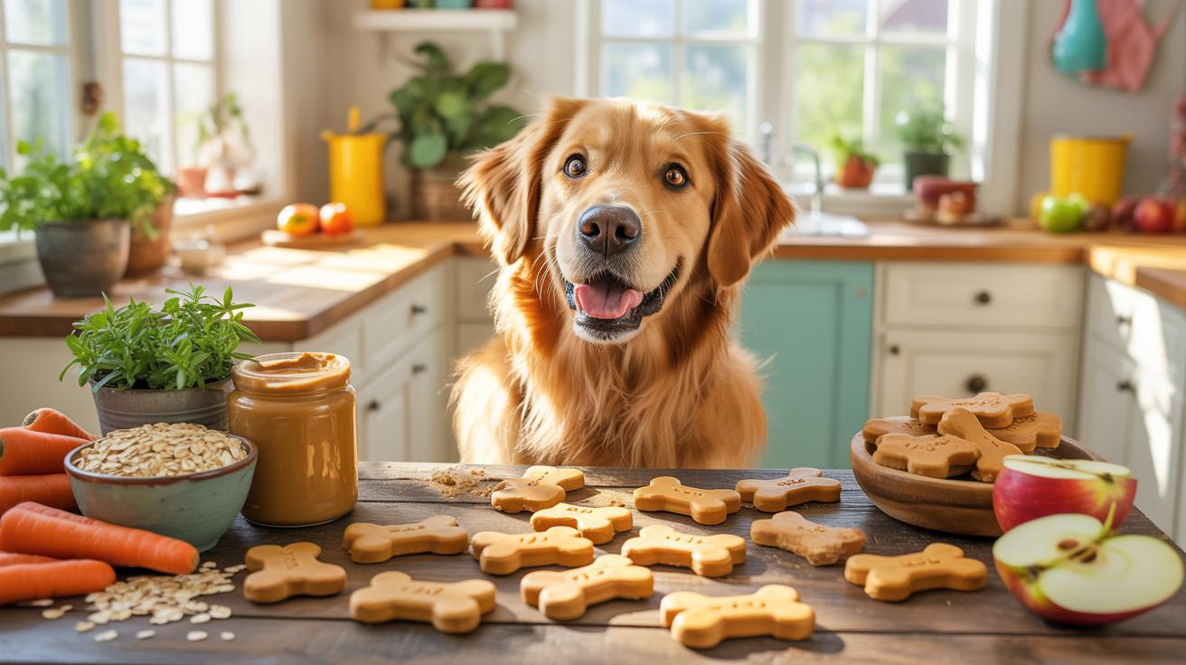
Pet Food Packaging Design Mistakes To Avoid For Brand Success directly impacts how customers perceive and trust your pet food products. A well-designed package attracts attention and communicates the quality and safety of the food inside. However, many brands miss essential aspects of packaging strategy, leading to poor sales and weak brand loyalty.
This article outlines critical packaging design errors pet food brands must avoid. We explore mistakes related to graphics, information clarity, materials, and user convenience. Correctly addressing these issues can help your brand stand out in a competitive market and build lasting consumer trust for your pet food products.
Avoid Confusing Label Information
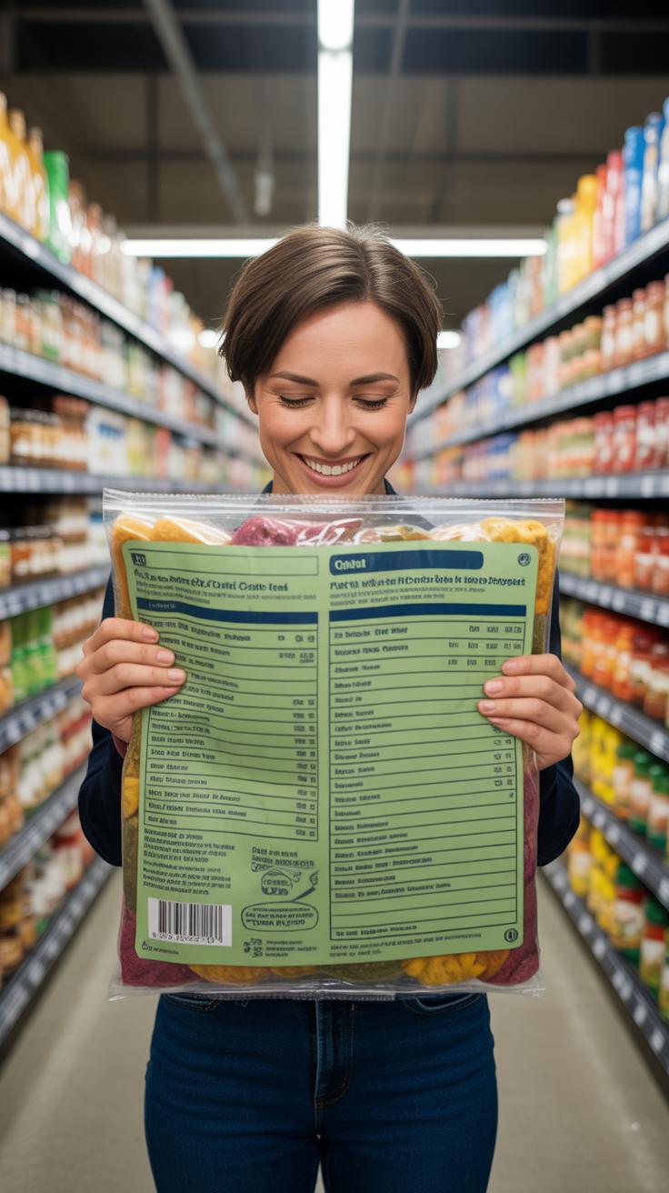
Clear and straightforward label information on pet food packaging matters more than you might think. When shoppers face labels loaded with jargon or tiny, cramped text, their eyes glaze over quickly. Too many technical terms—like “methionine” or “ascorbic acid”—can feel like a foreign language, pushing potential buyers away. If it’s tough to understand what’s inside, people often skip it altogether or choose a competing product with simpler info.
Nutrition facts, feeding instructions, and ingredient lists should be easy to find and even easier to read. Breaking down complex details into plain statements helps. For example, instead of just saying “crude protein 24%,” add a brief note like “supports muscle health.” Feeding guidelines work best when given in everyday measurements and paired with clear explanations, like “feed twice daily based on your pet’s weight.” Keep the language simple. It isn’t a chemistry exam after all.
Think about your own experience. When was the last time you stood in a store debating over a pet food bag, trying to make sense of a dense block of text? If you felt impatient or confused, you’re not alone. You want answers fast, without decoding.
Highlight Essential Nutrition Details
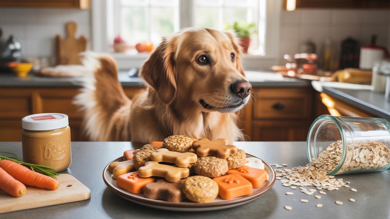
Pet owners care deeply about certain nutrition details. Protein content tends to be top of mind because it relates directly to their pet’s health. Fat amounts often matter too—especially for diets that manage weight. Vitamins and minerals make a difference, but only if presented clearly. Instead of listing every micronutrient, focusing on key highlights makes sense: “with omega-3 for a healthy coat” or “added calcium for strong bones.”
Legibility is crucial. Use readable font sizes and keep important points separate from less critical info. Color contrast helps as well. Imagine a bright red background with small black text—it will strain your eyes. Do you personally trust what you can’t easily read? Probably not.
Use Plain Language On Ingredients
Listing ingredients might seem straightforward, but it’s easy to stumble into confusing territory. Ingredient names like “tapioca starch” or “chicken byproduct meal” often make pet owners hesitate. Scientific terms like “dicalcium phosphate” can raise eyebrows without explanation. Using plain, familiar words increases honesty and trust.
Try this approach: replace “salmon oil (rich in eicosapentaenoic acid and docosahexaenoic acid)” with “salmon oil, a source of healthy fats.” Or instead of “zinc proteinate,” say “zinc from natural sources.” Pet owners want to know what they’re feeding their animals, not decipher chemical names.

At the end of the day, transparent and simple language remains the best policy. After all, if the label doesn’t speak clearly, your pet’s needs might not get the attention they deserve.
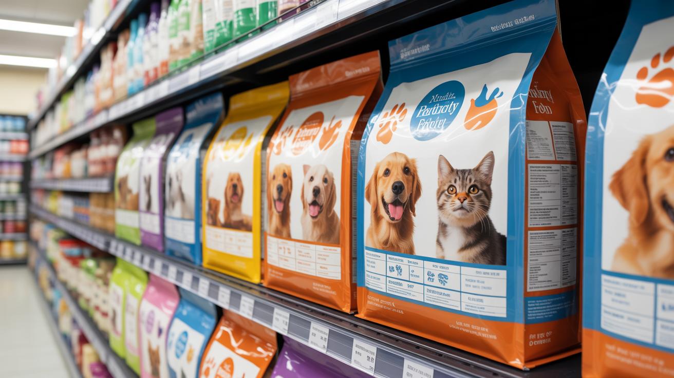
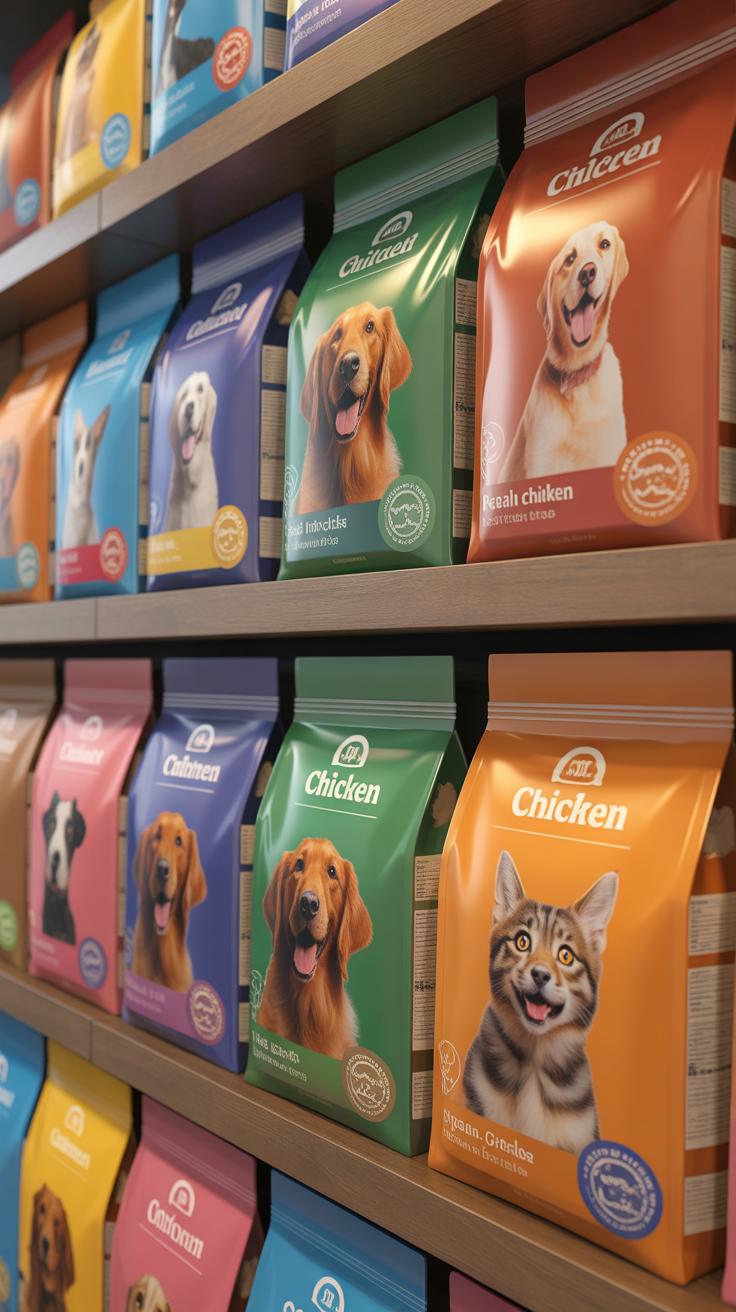
Design Packaging That Catches Eyes
When it comes to pet food packaging, the design needs to stop shoppers in their tracks. Bold colors can do this well—they pop off shelves and draw attention in a crowded aisle. But you don’t want to go overboard either. Using too many colors can make the design look busy or confusing, which often turns people away instead of inviting them in.
Clear fonts are another must. If your text is cramped or fancy to the point of being difficult to read, potential buyers might just skip over it. Think about how someone picks up a bag briefly before deciding—can they read your brand and product details at a glance?
Of course, a recognizable logo ties it all together. When customers see a familiar symbol, it builds trust and can nudge them toward your product. On the flip side, packing the design with too much information or multiple competing visuals tends to create clutter, making the important parts like your logo or product name fade into the background. That’s a common misstep, actually.
What stuck with me was noticing how some brands try to fit everything into a small space—nutrition facts, endorsements, promotions—all while using dull or muddy color choices that just blend with other packages. That approach rarely excites or holds attention. Sometimes, less really is more when you want your pet food packaging to catch the eye.
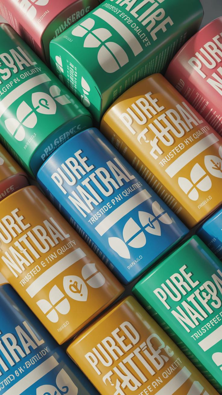
Select Colors That Stand Out
Choosing the right colors means balancing grabbing attention and staying true to your brand’s personality. For example, if your brand is all about natural ingredients, earthy tones mixed with a pop of bright accent might work well. But if you focus on energy or vitality in pets, then vibrant reds or blues could make more sense.
Try to pick colors that both contrast well with each other and don’t get lost on typical store shelves. This contrast makes your product easier to spot from a distance. At the same time, colors should feel intentional—not random splashes thrown together. Think of them as a kind of visual language that speaks directly to your target customer.
One tricky thing is some colors may look great on a computer screen but appear dull or muddy in print. Testing is key here. Sometimes I’ve seen brands stuck with colors that “look right” conceptually but just don’t pop when printed. Getting physical samples early can save headaches.
Choose Fonts For Easy Readability
Fonts on pet food packaging can’t be decorative showpieces at the expense of being readable. You want styles that customers can easily scan, even at a bit of a distance—think short glances as someone reaches for a product off a shelf.
Simple sans-serif fonts often work best. The letters stay clean and sharp, which helps differentiate important information like the pet food’s flavor or benefits. Font size matters too. Tiny text can discourage buyers who aren’t motivated enough to squint or bring the package closer.
Sometimes, small details like letter spacing or line height can improve legibility just enough to make a difference. Don’t overlook these. Also, avoid mixing too many font styles—it usually ends up confusing rather than clarifying. Instead, use a limited set of complementary fonts that keep the eyes moving smoothly across the key messages.
Prevent Material Failures In Packaging

Weak seals and poor moisture barriers can quickly undermine a pet food package. When seals fail, oxygen and humidity sneak in, causing the food to lose freshness or even spoil. You might think a small tear isn’t a big deal, but it often leads to significant quality issues and frustrated customers. Imagine buying a bag where the protective layer hasn’t held up—no one wants to deal with stale kibble or soggy treats.
Choosing durable, moisture-resistant materials is key for maintaining product quality. Laminated films, foil barriers, and multi-layer plastics offer solid protection against environmental elements. These materials reduce exposure to air and humidity, extending shelf life. It’s not just about preservation, either—they also stand up better during transport and on shelves, resisting punctures and tears.
Packaging that tears or punctures easily causes waste and sends customers running for competitors. A pet food brand I worked with once had frequent complaints because their flexible film ripped near the seal, leading to spills in-store and at home. The result? Returns, lost trust, and a hasty redesign. Avoiding thin or brittle materials that can’t withstand handling is crucial, even if it means slightly higher packaging costs. Your customers will notice the difference in product condition and durability.
Clarify Brand Message On Packaging
Your pet food packaging should say exactly what makes your brand special. Too often, brands fall into the trap of using vague claims like “high quality” or “premium ingredients” without showing why their product truly stands out. These generic phrases can blur your message and confuse customers, who are faced with dozens of similar claims on shelves.
Think about what your brand really offers. Is it a commitment to farm-sourced ingredients? A science-backed recipe for sensitive stomachs? Make those points obvious. Don’t expect shoppers to dig deep or guess. Clear, direct language wins here.
When it comes to listing benefits, simplicity works best. Let’s say your food is grain-free or allergy-friendly — state it upfront, in big, readable font. Customers searching specifically for these features should find them without effort. Avoid jargon. Using phrases like “natural ingredients” is better than lengthy descriptions that might go unnoticed.
One effective tip is adding brand story snippets right on the package. A short phrase like “Crafted with care by a family of pet lovers” can build trust and create an emotional connection. This might be a small touch, but it often makes a difference. People don’t just buy food—they buy stories, values, and reassurance.
Make Packaging Convenient For Users
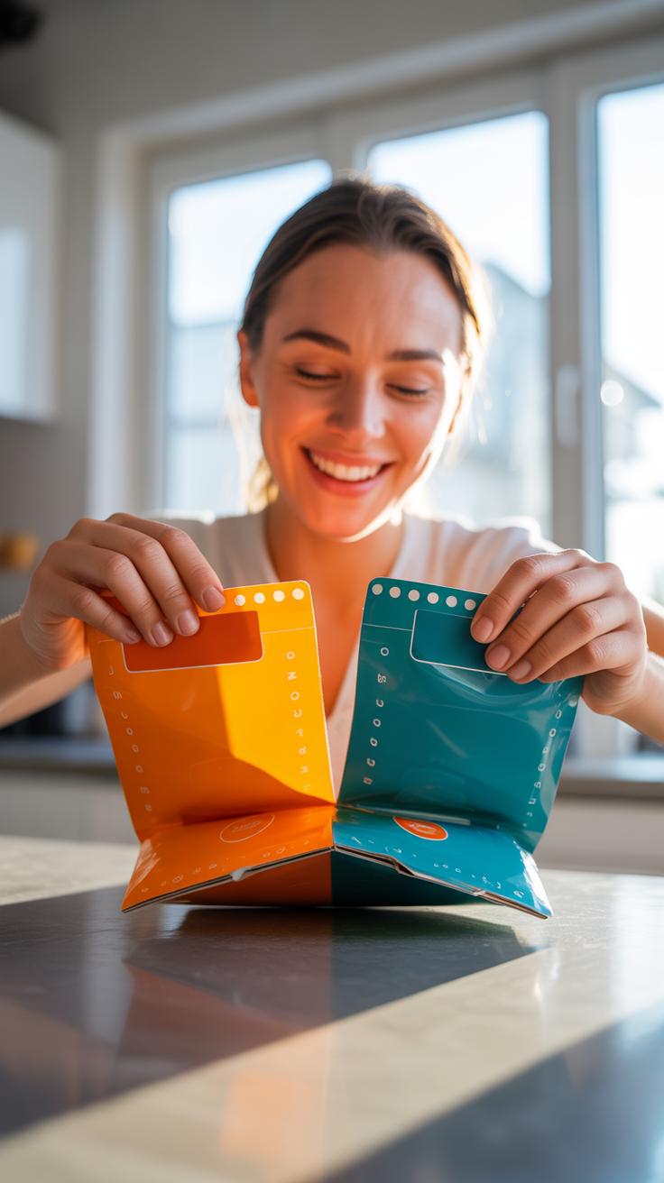
Packaging that’s frustrating to open can easily drive pet owners away, no matter how good the food inside is. Imagine struggling with a tough, sealed bag when all you want is a quick meal for your pet. It’s a simple annoyance, but it can linger in the mind, especially for older users or anyone with limited hand strength.
Resealable zippers play a quiet but vital role here. By allowing pet owners to close the package tightly after each use, they help keep food fresh longer. It’s more than just convenience—it protects the product from moisture and pests, making customers feel like they’re getting real value.
Designing packages that open effortlessly isn’t just a nice idea; it’s necessary. Features such as easy-tear notches or pull tabs make a huge difference. Think about someone with arthritis or a parent who’s hurried—with an awkward package, you risk losing their repeat business before they even realize it.
Simple adjustments can improve user experience significantly:
- Rethink seal strength so it’s secure but not stubborn.
- Include clear, tactile indicators for opening points.
- Consider different package shapes that fit natural hand motions.
Pet owners want something that works right away, without extra tools or effort. Isn’t it curious how something as small as packaging ease can sway loyalty? It probably does more than we often give it credit for.
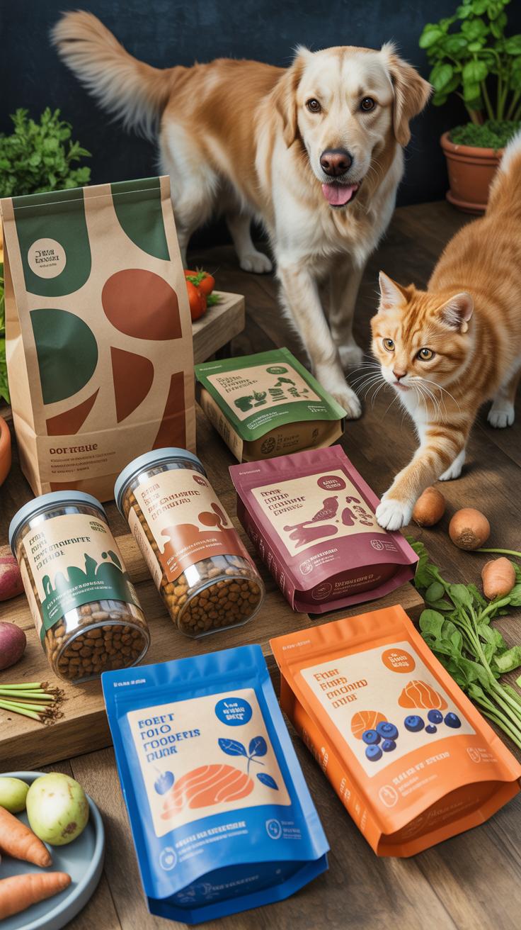
Compare Dry Versus Wet Food Packaging
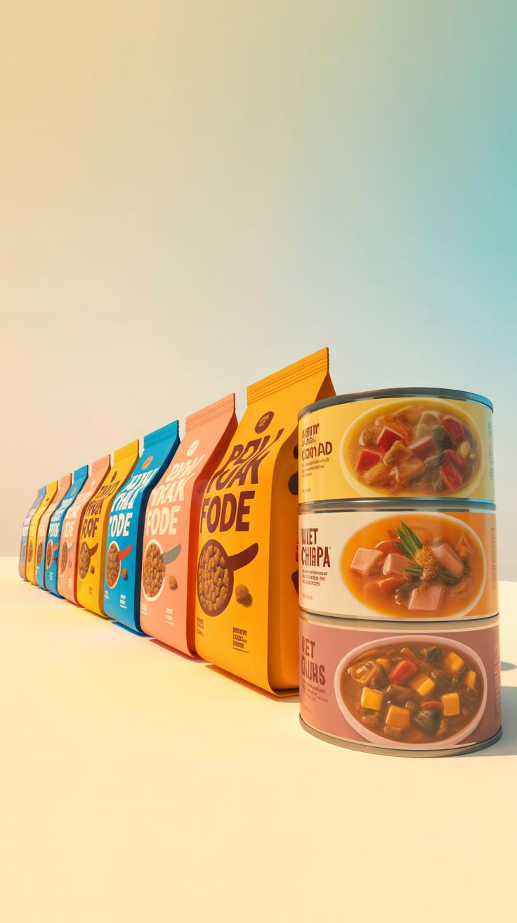
Dry and wet pet foods have quite different packaging needs, mostly because of their moisture content and shelf life. Dry food is low in moisture, so it’s prone to staling or absorbing odors. That means packaging needs to keep air and humidity out, but also be resealable to maintain freshness after opening. Think stand-up pouches or multi-layer bags with zip locks—materials like laminated films combining polyethylene and aluminum foil work well here.
Wet food, on the other hand, contains high moisture and requires airtight, leak-proof packaging to avoid spoilage. Cans are the classic choice—steel or aluminum can handle the wet contents, are sturdy, and provide an excellent barrier against oxygen and light. Alternatively, retort pouches, those flexible foil pouches that look like little bags, are gaining ground. They’re lighter and easier to open than cans but might differ in perceived quality depending on your audience.
Best Packaging For Dry Pet Food
When it comes to dry pet food, bags with zippers or resealable stand-up pouches are probably your best bets. They’re convenient, easy for consumers to handle, and can be made from flexible films that protect the kibble from moisture and oxygen. These pouches can stand up on shelves for good visibility—something brands can’t ignore.
- Multi-layer films combining plastic and foil for moisture barrier
- Easy-tear notches for consumer convenience
- Matte or gloss finishes based on brand tone
I’ve noticed that some brands skip resealable options, which makes me wonder if it’s just about cost savings or a real misunderstanding of consumer needs. It’s frustrating when you have to transfer kibble to another container to keep it fresh. On the other hand, too bulky packaging can turn shoppers off. So there’s some balance to consider.
Packaging Solutions For Wet Pet Food
Most wet foods come in metal cans or retort pouches. Cans are tough, stackable, and have a long track record. But opening cans isn’t always convenient, and they’re heavier to ship. Plus, they’re less flexible for smaller portion sizes.
Retort pouches can be opened more easily, are lighter, and allow for interesting shapes and graphics—possibly a better fit for premium or fresh-feeling products. But some consumers still prefer cans, associating them with tradition and quality. Oddly, I’ve seen some brands combine both, using cans for large sizes and pouches for singles or travel packs, which could confuse brand identity a bit.
- Cans: durable, good barrier, less convenient
- Retort pouches: lightweight, flexible design, less familiar
Choosing the right packaging for wet food means balancing cost, consumer expectations, and practicality. You might wonder if shifting entirely to pouches would alienate longtime customers or if sticking exclusively to cans overlooks emerging preferences. It’s tricky, and brands need to test their audience carefully here.
Checklist For Pet Food Packaging Compliance
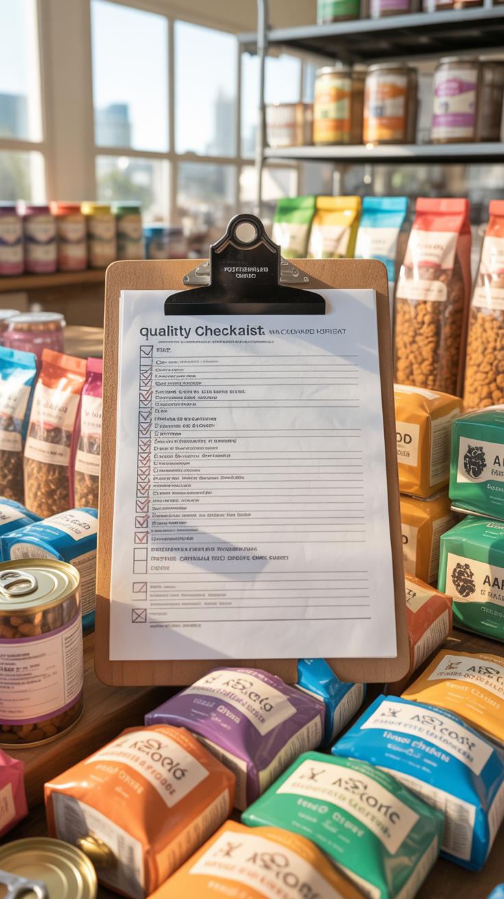
When it comes to pet food packaging, getting compliance right feels like navigating a maze. Different markets have varying demands, and missing just one detail could cost you—penalties, lost trust, or worse. Let’s break it down with a checklist you can actually use.
Labeling Requirements To Follow
Labels need to carry certain pieces of information that consumers, regulators, and even vets expect. The FDA rules in the US, for example, spell out specific points, including:
- Ingredient list with proper common or usual names.
- Nutritional adequacy statements, meaning your product has passed tests or meets recognized profiles.
- Guaranteed analysis showing minimum percentages of crude protein, fat, and maximums for fiber and moisture.
- Name and address of the manufacturer, packer or distributor to provide contact information.
- Net weight displayed clearly on the principal display panel.
- Feeding directions, especially for specialized diets.
- Affirmative statements about the intended species (dog, cat, etc.).
You might wonder—do all countries require the same things? No. The EU demands nutrition declaration following their own format. Canada has the CFIA’s rules that can be stricter in some aspects. So, always cross-check local regulations if you plan to export.
Packaging Material Regulation Tips
Packaging isn’t just about looking good. The materials in contact with pet food must be safe and non-toxic. The FDA specifies materials that must not transfer harmful substances. This means no heavy metals leaching or plastic components that could degrade into the food.
Many brands overlook environmental standards, but those are slowly becoming part of compliance everywhere. The EU, for instance, encourages recyclable or biodegradable packaging, and this affects material choice and labeling claims.
Also, the type of packaging affects shelf life and safety—airtight seals, moisture barriers, and UV protection can all matter. You might think these are more about marketing, but regulators do look at the actual protection provided against contamination.
Here’s a quick checklist to run through:
- Verify all label elements against your target market’s official guidelines.
- Ensure ingredients and nutritional info match your product tests.
- Double-check contact details are accurate and current.
- Confirm packaging materials meet FDA or equivalent safety standards.
- Assess environmental requirements for materials and recyclability.
- Test packaging for food safety beyond just appearance and branding.
Skipping even one point can lead to delays or complications—something I’ve seen firsthand when a label missed the net weight unit. These things might seem small but can become major hurdles when selling widely. So, better to put your checklist on the desk or attach it to your design briefs, just to keep it close.
Costs To Consider In Packaging Design

When you start planning packaging for pet food, the costs pile up quickly. It’s not just about picking a pretty design—you have to budget for materials, printing, and the design process itself. Materials can vary widely in price. For example, flexible pouches usually cost less than rigid containers but might not offer the same protection or shelf appeal. Printing methods like digital printing can be affordable for small runs, but if you scale up, offset printing might save money in the long run.
Material choice often affects how your package looks and how it performs on shelves. Thicker plastics or biodegradable options tend to cost more. Sometimes, you might want to use specialty inks or finishes, which add another layer of expense. But can you really cut corners there? Probably not without risking how your product is perceived.
Design services don’t have to break the bank. One approach is to work with freelance designers or smaller studios instead of big agencies. You might get less “flash,” but with clear communication, the outcome can still look professional. If you have a tight budget, start with simpler designs and add complexity later when you have more resources. It’s a bit of a balancing act.
Think about where you can save and where you can’t—sometimes investing a bit more upfront avoids bigger costs later, like reprinting or redesigning after poor shelf performance. Would you want to skimp on quality when it’s your brand at stake?
Explore Packaging Trends In Pet Food
When you look at pet food packaging today, several trends stand out—some more quietly than others. Eco-friendly materials are definitely catching attention, especially among buyers who care about the planet. You might find bags made from biodegradable plastics or even paper-based pouches that break down faster. These options don’t just look good on the shelf; they seem to connect with consumers who want their choices to reflect their values. But sometimes, the challenge is whether these materials keep the food fresh enough—something brands are still figuring out.
Minimalist designs are also quite popular. Clean lines, simple fonts, and restrained colors can make a product feel modern and trustworthy. It’s like the packaging is whispering, “I don’t need to shout to prove I’m good quality.” This can catch your eye amid a crowded shelf, but it might also risk looking generic if overused.
Then there’s smart packaging. QR codes are popping up everywhere, letting you scan for recipes, product origins, or feeding tips. Freshness indicators are less common but intriguing—imagine a small color change that tells you if the food is still fresh or not. These features give you something more than just a bag or a can; they create interaction, maybe even loyalty. Though, I wonder how many people actually use those features versus just ignoring them.
All these trends show a clear shift toward appealing to modern pet owners who want transparency, sustainability, and convenience. But can one packaging approach hit all those notes perfectly? That part feels still in progress.
Example Successful Pet Food Packaging
Case Study On Brand Visibility
Take the example of Blue Buffalo, a brand that really stands out on crowded shelves. Their packaging uses bold blues and bright orange accents, which immediately catch your eye—something you might not expect for pet food. What’s clever is the clear, straightforward messaging on the front, like “natural ingredients” and “grain free.” You don’t have to squint or search to understand what the product offers.
This simplicity mixed with strong color contrast helps Blue Buffalo dominate shelf space. It’s a good reminder that bold colors paired with direct messaging can make a brand memorable. Of course, this approach might risk alienating those who prefer subtlety, but it clearly works for many customers who want clarity fast. If you’re aiming for visibility, think about what colors will pop in your product category and keep your message unambiguous, yet not overwhelming.
User Friendly Packaging Success
Look at Zuke’s packaging to see how user experience can raise customer satisfaction. Their resealable pouches are easy to open—no awkward fumbling or excessive tearing. The zipper mechanism feels sturdy yet smooth, which means the food stays fresh longer, and pet owners can access treats quickly.
This small detail makes a real difference. Several customers mention repeatedly buying Zuke’s partly because it’s convenient to use. It’s funny how something as basic as a resealable pouch can influence loyalty. It brings up a good question: if your packaging frustrates users, are they less likely to pick your brand next time?
The lesson? Spend time testing your packaging with real users. Even minor improvements, like a smooth zipper or easy tear notch, can boost satisfaction and, ultimately, sales.
Conclusions
Good pet food packaging design balances clear information, appealing visuals, and user-friendly features. Avoiding common mistakes such as unclear labeling, weak brand messaging, and low-quality materials can improve customer trust and repeat purchases. Each design decision should support your brand’s value and product safety.
Invest time in planning your packaging carefully. Test designs through user feedback and compare with competitors. By refining your pet food packaging, you help your brand grow stronger and ensure consumers recognize the quality of your product at first glance.